
Note: the comments on height and the greenhouse effect are not accurate. Please see next article for a better description
Summary so far
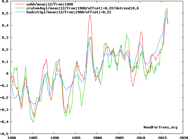
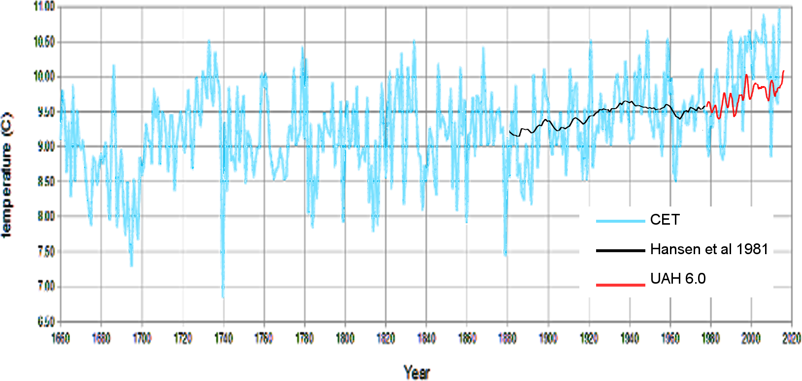
In previous articles, I have tried to work out to what extent I can produce a global temperature which is free from the “thumb on the scales” as Dr Bates referred to NOAA’s own attempts to get rid of the global temperature pause. There are also indications that NASA have been trying to get rid of the 1970s cooling.
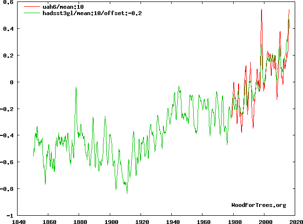
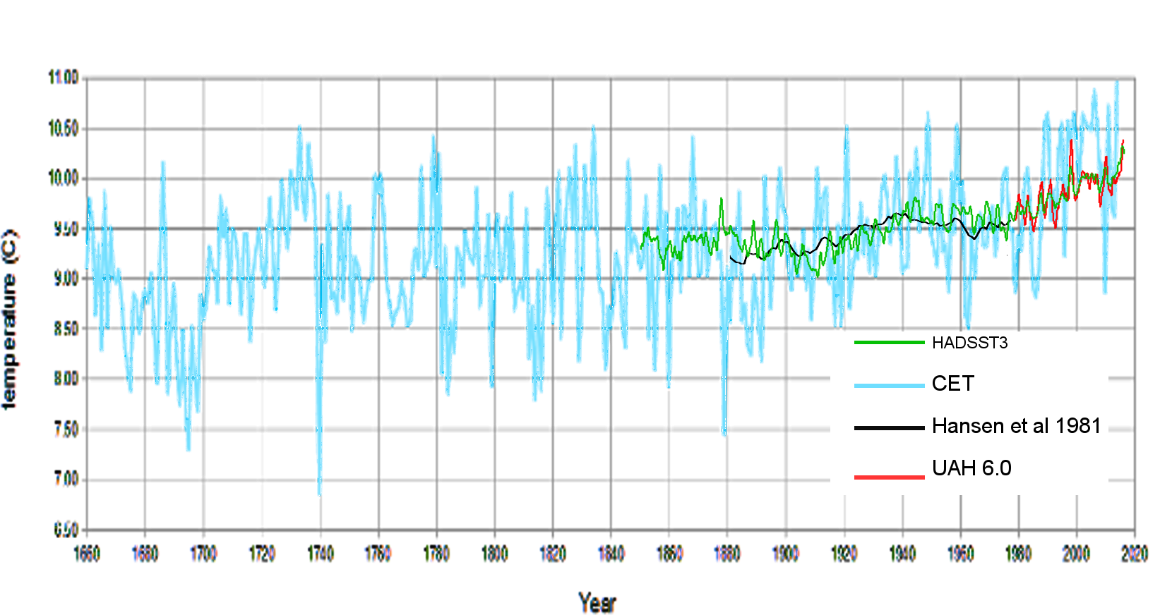
I am reasonably confident that the satellite data is the best available global temperature we have. This is because it is the only sensor where we have a known quality standard and traceability of calibration back to recognised standards. In contrast, from my own experience, I know that ground sensors have huge problems, and there is a complete lack of quality control which would make even a chocolate chip manufacturer squirm.
So, far I have identified an apparent yearly increase in land surface temperature apparently starting in 1970. I have proposed a way to remove this and was at the stage of comparing my proposed solution with available temperature sets when I went to look at Meteorological balloons.
Meteorological Balloons
I downloaded the data from NOAA and produced this.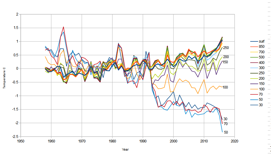
Something is very odd with this. All the layers above 300mb (9km) are cooling and the higher ones most and the lower layers are warming. Could this be the signature of global warming? According to the Noddy theory of global warming, CO2 traps IR, so this, Noddy researchers might conclude is the signature of greenhouse gases: the heat is trapped in the bottom of the atmosphere and so there’s no heat for the top. Continue reading


