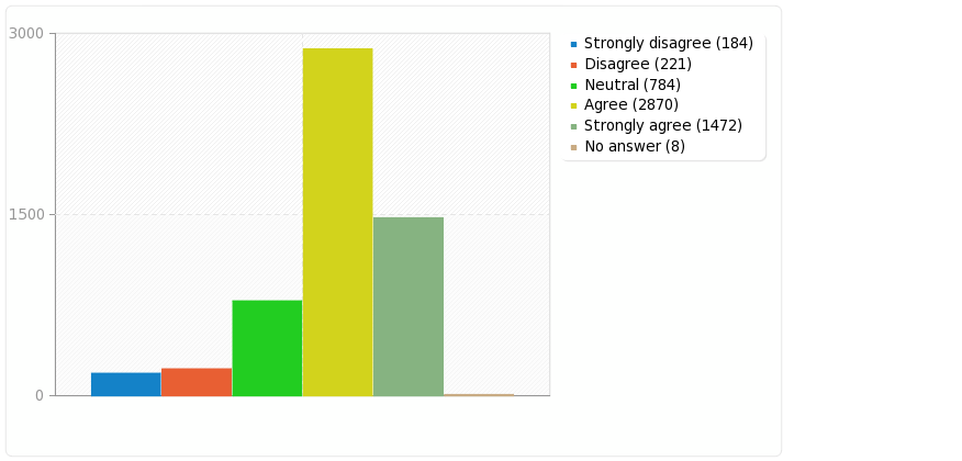
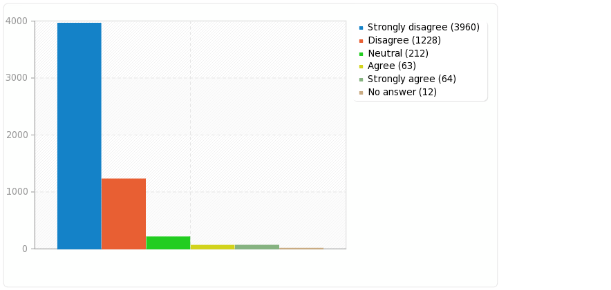
| Field summary for Q05 | |||
|---|---|---|---|
| Have you worked in science for more than one year? | |||
| Answer | Count | Percentage | |
| Yes (Y) | 1050 | 25.41% | |
| No (N) | 3081 | 74.55% | |
| No answer | 2 | 0.05% | |
![]() |
|||
| Field summary for Q05 | |||
|---|---|---|---|
| Have you worked in science for more than one year? | |||
| Answer | Count | Percentage | |
| Yes (Y) | 1050 | 25.41% | |
| No (N) | 3081 | 74.55% | |
| No answer | 2 | 0.05% | |
![]() |
|||
I just love watching these high cost committee produced greenblobbiest videos from the pause deniers to see just how soon they start telling lies. And I did not have to wait long. After the 10s “I did media studies” type intro, the video failed … in 2 seconds flat … on the sixth word:
“Let’s not beet around the rapidly melting ice …”
All their money gone to waste – they can’t be pleased with the latest news:
I was reading Bob Tisdale’s blog Absolutely Amazing! A Climate Scientist Writes a Blog Post about… in which he discusses a post on unRealClimate, in which unRealClimate discuss Anthony Watts blog’s widget. (right)
And I was looking forward to seeing how they would replace the widget. Obviously it would turn from blue to red, their graph would highlight 1970-2000 and “hide the pause” afterwards, etc.
Time and again I hear nonsense from people saying climate signals are, or are not, “significant”, by this they suppose they mean “cannot be normal”. But they ignore the fact that in order to say whether or not something it abnormal, we must know what is normal. And they do not know what is normal but assume a model of “normality” which is totally wrong for the claimate. So I decided to write this explanation of 1/f climate noise to help explain the difference.
It’s often easier to see something that for someone to explain it. So it might help to have a look at the demo of 1/f noise I have at uburns.com (I’ve jokingly portrayed this as a “forecast” but it just generates noise similar to climate noise. Further info is on the about page. I’ve got some results showing how variance increases: Statistics of 1/f noise – implications for climate forecast. And I’ve even collected together a few examples of how 1/f noise causes errors in interpreting data even by sceptics: Natural habitats of 1/f noise errors.
Also for a wider perspective of how we need to know the underlying variation in order to know what is meaningful see: Lies, damned lies, and statistical significance of climate trends
The so called “normal distribution” shown right is arguably one of the worst concepts in the whole of mathematics and science. I suspect is the single biggest cause of the failure of climate academics to comprehend why they can’t predict the climate.
Continue reading
I’ve been collecting a few interesting curves from the 1/f generator at uBurns.com and here is a selection showing the kinds of features that are typical of 1/f noise and which we regularly see being mistaken for “something”.
Note
First all references to “forecasts” is just my attempt at humour. It is 1/f noise, but such noise makes it impossible to forecast and it’s ridiculous to attempt to do so.
The plots are:
Habitat of error: IPCC report and almost every alarmist website.
A very common characteristic of 1/f noise is that there will appear long-term trends. These are just the coincidental juxtaposition of smaller trends which happen all to go the same direction, but they clearly confuse some academics who cannot understand that such trends are perfectly natural.

Across at uBurns.com, a slow trickle of people have been looking at the page giving me a total of 221 page views. So, I thought there was enough data to do some preliminary stats.
First to recap: the climatic temperature data has a 1/f frequency response showing that natural variation can be modelled by 1/f noise. So assuming all the variation is natural we should be able to model climate with 1/f noise. But little has been written on the statistics of 1/f so it is difficult to know how it will behave. So, I have created a simple 1/f noise generator at uBurns.com and am using this to get data.
To do this, I’ve split the 1000 or so data points of each trial into 16 “buckets” and recorded the average value and slope of each bucket for each trial.
The predictions I made were as follows:

As predicted the variance (sum of squares) of the 1/f noise (shown above in blue) increases with each successive “bucket” so that the increase is proportionate to the square root of the number of points (or in this case buckets). It’s not a perfect fit, but it looks like it’s heading that way. Continue reading
Over the years I’ve introduced and/or started using a few words. So, here is a list of ones that as far as I know I was first to use – together with a few others.
The Pause
I coined the phrase “the Pause” around 2007 when I still edited Wikipedia. I did so in order to try to get a Wikipedia section about the slowdown in temperature. For obvious reasons, there was no way the climate academics who edit wikipedia would allow words like “stop”, “halted”, when referring to global temperature. So “pause” was the mildest possible way I could think to say “stopped” whilst still pandering to their view that it would continue. But even this was denied by those academics. Continue reading
Results from survey “Professional Background & Attitude to Climate” undertaken in Spring 2014