The Enerconic or society energy multiplier

In my last article Enerconics II I introduced the concept of the energy multiplier. In other words, we effectively create a pseudo-perpetual motion machine in the sense that the total apparent energy available to society is far higher than the amount of energy we sue.
However, the explanation is very simple: we consume energy once (thus abiding by the laws of science) but we use it – or at least the things produced by it – many times. We can measure this multiplier by:

n = (GDP per capita) / (Cost per KWh * KWh per capita)

And in modern society n is about 4. Continue reading

Posted in Climate, Economics, Enerconics | 1 Comment

When theory hits the buffer – maybe CO2 does not have an effect?

I’ve come across evidence that could be interpreted as showing that there is some kind of mechanism in the atmosphere that compensates for changes in greenhouse gas composition so that changes in CO2 levels would be insignificant. This is in no sense finished work, but is instead a very brief outline to make others aware of this potential. Continue reading

Posted in Climate | 6 Comments

Understanding Global Temperature IX – the role of CO2

Summary

Can I see anything except global greening that’s due to CO2? I can honestly say No. And anyone who says they can see any change due to CO2 is crackers. In contrast, I am now reasonably confident that Environmental Action in the 1970s was the major cause of post 1970s warming and that the preceding increase in pollution may well explain the global cooling scare.

Intro

See also: previous article that lists all other articles in this series
If I were an alien looking down on earth, the only noticeable change that I could detect as a result of rising CO2 would be a greening of the planet which leading to increased harvests has been undoubtedly a good thing. Continue reading

Posted in Climate | 1 Comment

The Paris Treaty is Dead

One of the great debates amongst sceptics these days is whether Donald Trump can unilaterally withdraw from the climate “treaty” … because without ratification it’s not binding on the next president.
However, as always we “do it by the book” sceptics have missed the obvious. He will just ignore this non-binding treaty. As the Toronto Sun puts it

While Prime Minister Justin Trudeau will never admit it, the 2015 Paris climate treaty Canada signed with great fanfare died last week.
It died because of the release of U.S. President Donald Trump’s 2018 budget plan.
While Trump has to get it through the U.S. Congress, which means parts of it are unlikely to survive, his clear intention to gut U.S. climate change policy by dismantling the Environmental Protection Agency spells the death knell for the Paris treaty.
Trump is proposing deeper cuts to the EPA than any other government agency, reducing its $8.2 billion budget by 31%, laying off 19% of its 15,000 staff and cutting 50 programs.

As the leader of the developed world, America’s participation in the Paris treaty was vital to the United Nations’ Paris treaty.That’s why the UN abandoned its previous commitment to binding emission reduction targets in Paris, to get the U.S., then under Obama, on board.
A treaty with binding targets would have required Obama to get the deal approved by the U.S. Senate, impossible given its Republican majority.
At Obama’s behest, the Paris treaty was designed so he could introduce his Climate Action Plan through EPA regulations, rather than legislation. (Toronton Sun)

In other words, third rate “science”, was being used to justify political action which Obama was going to force upon the US population with no consent, bypassing congress and the senate and using presidential executive orders.
But because Obama’s actions had no constitutional backing nor any backing from any binding treaty signed by the Congress and Senate all Trump has to do is to instruct the EPA to ignore those presidential orders and the Paris agreement is dead.
In the past I’ve likened the climate issue to a war. The sceptics have now taken almost all the high ground, and now the main alarmist weapon of the “Paris Treaty” has been effectively removed from the battle. The last remaining battle is for the end of “fake science” and the return of honesty, integrity and reproducibility.
 

Posted in Climate | 1 Comment

Understanding Global Temperature VIII – It was the greens wot warmed us!!

Little did I realise when I started looking for a metric to use to represent the real global temperature for the last few hundred years that I might stumble across such compelling evidence.

First to recap.

Understanding the Global Temperature “discrepancies”
Started by looking at the various temperature series to try to understand the differences.
Understanding the Global Temperature II
Took this further and suggested that a combination of satellite temperatures and before that global sea surface temperatures and before that the Central England Temperature records would form the best basis of a proxy.
Understanding the Global Temperature III
Discussed the the discrepancy between sea and land based metrics which depart from each other around 1970 and are particularly acute in the northern hemisphere, but noted that the year-to-year based changes shown on UAH were found only in the land based metrics.
Understanding Global Temperature IV
Presented a pseudo proxy based on all the above work. (And the next step was to check this against various proxies).
Understanding the Global Temperature V – Met Balloon Data
Presented an analysis of the metrological balloon data. This was separated by height and because it was not clear which height I should use, I plotted the lot, only to find a very obvious change in temperature trend with height. Unfortunately, the hand waving argument I used to understand whether this could be the “fingerprint of CO2” was wrong.
Understanding the Global Temperature VI
So, the next article corrected the previous analysis showing that the change from heating to cooling occurred at ~10km. This is both the height at which aeroplanes fly AND the top of the troposphere. So whilst it could be contrails, it could also be something happening in the troposphere.
However, on the basis that the main heating discrepancies occurred over northern land and might be explained by contrails at around 10km, I investigated the global distribution of aeroplane flights and tried to correlate this to the 1985-2014 map of global temperature trends. This worked for group based winds, but not higher ones, leaving me questioning whether contrails were really responsible.
Understanding the Global Temperature VII
Went back to look at the original aim which was a global temperature reconstruction. And asked the question: why is the global satellite year-to-year temperature change best reflected by 1/7 of the earth’s surface: the land-based year-to-year changes, but the long term satellite (&CET) changes by sea surface temperature. (I have no answer to this yet).

Understanding Global Temperature VIII

Today, I’m going to look more at the global flow of industrialised aerosols and present a possible explanation for global temperature changes – at least since 1970, and potentially long before.
Continue reading

Posted in Climate | 4 Comments

Enerconics II

It’s a while since I originally wrote my first article “Enerconics: The Relationship between Energy and GDP” in which I presented evidence showing that GDP was closely related to energy usage both in terms of differences between global economies and also historically. A typical diagram is as follows:

This shows a very clear relationship which in 2007 was  $0.45 of GDP per KWH of energy. In 2007 the average cost per KWH was about $0.09. Continue reading

Posted in Climate, Economics, Enerconics | 3 Comments

SNP: liars & economically insane.

C60idFsWkAYoKgh.jpg largeIn 2014 the Scottish people voted decisively to stay with the UK. And since then the consensus has remained the same with a majority against leaving the UK and particularly against having another extremely divisive and hate filled referendum.
At the time the SNP promised that the referendum would be a “once in a lifetime”. They did so for very cynical reasons. If there were a suggestion that we could have the same referendum in a decade or so – given the appalling management of the Scottish economy and their daft policies (like appointing a state Guardian to be in charge of all children)  many people (including me) wanted to wait to see if Scottish politicians might one day mature enough to warrant a vote to leave the UK.
https://youtu.be/6HyUmDuPa6g
Continue reading

Posted in Climate | 10 Comments

All time Top Articles

Since I started this blog at the beginning of  2011 I’ve published over 1200 articles mostly focussing on climate and energy. But it often surprises me when I look at the statistics that many of the articles that get read most have little or nothing to do with climate.

Scots: more words for rain than Eskimos for snow More stats 10,940
The Truth about the Highland Clearances More stats 6,632
I’m now a CO2 denier More stats 3,483
Enerconics: The Relationship between Energy and GDP More stats 3,024
How to convince a sceptic – just give them the data More stats 2,202
Proof: recent temperature trends are not abnormal More stats 2,073
We live in luxury that even kings a few centuries ago could only dream of. More stats 1,894
How to run a house off the car battery More stats 1,379
How to get off the ground with nothing but water! (almost) More stats 1,163
A scientist’s guide to greenhouse warming. More stats 1,143
Scientists discover why wet soil is dark More stats 1,071
And the last global warming pillar falls – I declare global warming doomsday claptrap to be disproven. More stats 985
The Academic Ape: Instinctive aggression and boundary enforcing behaviour in academia More stats 942
Why are climate-extremists so obsessed with conspiracy theory? More stats 927
This year global cooling – now even Trenberth agrees with me More stats 873


Posted in Climate | 2 Comments

Understanding the Global Temperature VII

I started trying to reconstruct a global temperature graph. I found that land based measurements like CRUTEM were reading too high and identified this as massive warming in Northern hemisphere land based measurements.
Sea surface measurements like HADSST gave longer term trends that were more consistent with satellite data and other metrics. However, they did not have the same year to year changes as the satellite data.
So, I proposed to take the fast changes from CRUTEM and add it to the longer term trend of HADSST as I hope the following graph shows:
Reconstrition20The top green is CRUTEM (land) – which leads the pack showing excessive warming. The lower green (toward the end) is CRUTEM less any longer term trends. The blue line is the sea temperature from HADSST with short term trends removed.
Purple shows UAH6 satellite and Red shows my reconstructed metric which simply adds long term trends from the sea measurements to short term trends from land.

Discussion

This is clearly a good fit. “HASELER” is a bit low in the 1998 El Nino year and a bit too high in the 2016 El Nino year. But generally HASELER reconstruction follows UAH6 well.
Except … it shouldn’t!!
I’m happy that the sea temperatures representing 6/7 of the globe might represent the vast majority of global temperatures and so the sea long term trend will be close to that of the global temperature. But why on earth does the short term changes in global temperature reflect only the land-based measurements. It should only be 1/7 of the changes.
This suggests to me that most of the short term changes in global temperatures are affected by what happens over land and that the atmospheric transfer into the sea is relatively poor.
This suggests that over short periods the air flowing over the land, determines the temperature (or is determined in temperature by) the atmospheric temperature. But that what determines long term temperatures is the sea (or what is determined by long term temperatures).

Posted in Climate | Comments Off on Understanding the Global Temperature VII

Understanding the Global Temperature VI

Yesterday I had a look at meteorological balloon data
RadioSonde1and found that if we plot the trend as shown, RadioSonde2
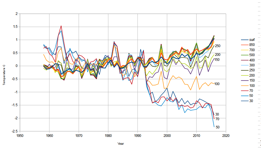
below 10km (200mb) the atmosphere was warming and above it, it has been cooling and that this cooling reached a minimum at around 50mb (20km). At this point I rather cocked up on my explanation of what was happening in the atmosphere. So I’ll go back over it with some actual calculated changes rather than trying to work it out in my head.
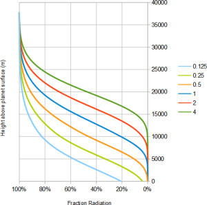
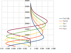
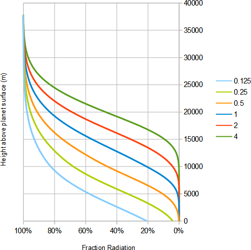
We can think of the atmosphere as emitting radiation to space as shown below. We start at the top of the atmosphere where we naturally have 100% of the emitted radiation. As we go down through the atmospheric layers emitting radiation the percentage falls from 100% at the top downward depending on the proportion of greenhouse gases. And as we can see as we double or halve these percentages we in effect raise or lower the curve.
RadiationHeight1
However, what matters for us here is not what happens to this curve, but the change in radiation from any layer. The amount any layer/height emits is inversely proportional to the gradient of the curve. This is shown below for selected curves from that above to show what happens.
ChangeInRadition
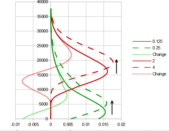
Starting with a a percentage where almost all emission occur from the atmosphere (red). If we increase the gas concentration (2  → 4) the change in emissions with height is the red dotted curve. There’s no change at ground level, then as we rise we reach a region when the lower curve is emitting most so there is a drop in emission. Then we change to a region where the raised curve is emitting most and there is an increase in emissions. Finally when we rise up far enough, there’s too little greenhouse gas to cause any emissions.
The situation is similar with a curve where some radiation come from the ground except the lower part is cut off (and obviously there’d be a dramatic change at ground level).
If we now compare this curve with the balloon data we find:

RadioSonde2 ChangingRad

The left curve changes from warming in the lower atmosphere to cooling at 200mb or 10k. On the arbitrary scale of quantity of greenhouse gases, the curve marked “1”  changes from cooling to warming at 10km. However it peaks at 15km whereas the balloon data seems to peak at 50mb (20km). Also the right have “1” curve shows no net change of temperature at ground level whereas the curve on the left shows increased warming right to the ground and in the northern hemisphere (which is filled with land) the warming increases down to the ground. This is not compatible with a greenhouse gas. It seems more compatible with IR in a radiation window being blocked by a layer as it would by contrails.

Heatflows

However … what I cannot factor in is heat flows. The lower troposphere is continually overturning and heat moves throughout this region easily. The average depths of the troposphere are 20 km (50mb) in the tropics, 17 km (90mb) in the mid latitudes, and 7 km (400mb) in the polar regions in winter. The balloon data shows the equatorial change of sign occurs at 140mb (14km) the northern extra-equatorial at 240mb (10.5km) and souther extra-equatorial at 255mb (10.1km)
In other words, the temperature warming appears to be correlated with the troposphere and the cooling with the stratosphere.
As the sharp change occurs where the atmosphere changes characteristics and also where aeroplanes fly leaving con trails and also it is an important boundary layer between heat in the bottom of the atmosphere and top – so any change in atmospheric flows could change the heat, I’m now less certain as to what may be causing it.

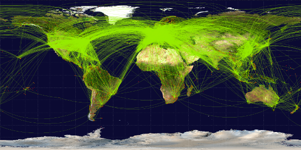
The heat rabbit from the hat


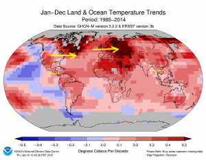
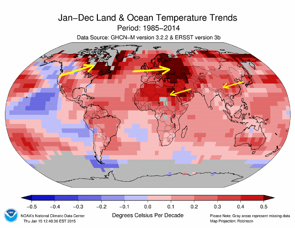
This graphic shows the aeroplane routes. Now compare it with a map of long term warming trend from 1985:
Trend0

Warming trend 1985-2014


Areas with large concentrations of aeroplane routes seem to be close to areas that have warmed most. But now if I add in trade wind vectors:
Trend1

Warming trend 1985-2014 showing selected trade winds


I get very good correlation between the most dense areas of aeroplanes routes (N.America and Europe) and the areas of warming are downwind of the trade winds. Which seems like fairly conclusive proof that aeroplane contrails did it. Until I show the stratospheric winds which is what would push contrails along …
 showing selected trade winds

Warming trend 1985-2014 showing selected stratospheric winds


Now the N.American hot spot is too far north. This suggests that the main culprit is being driven along by lower atmospheric winds. Now we are looking for something that affects the lower atmosphere. Something showing dramatic changes since 1970 …
PARRISH_4823_Fig-2_rgb
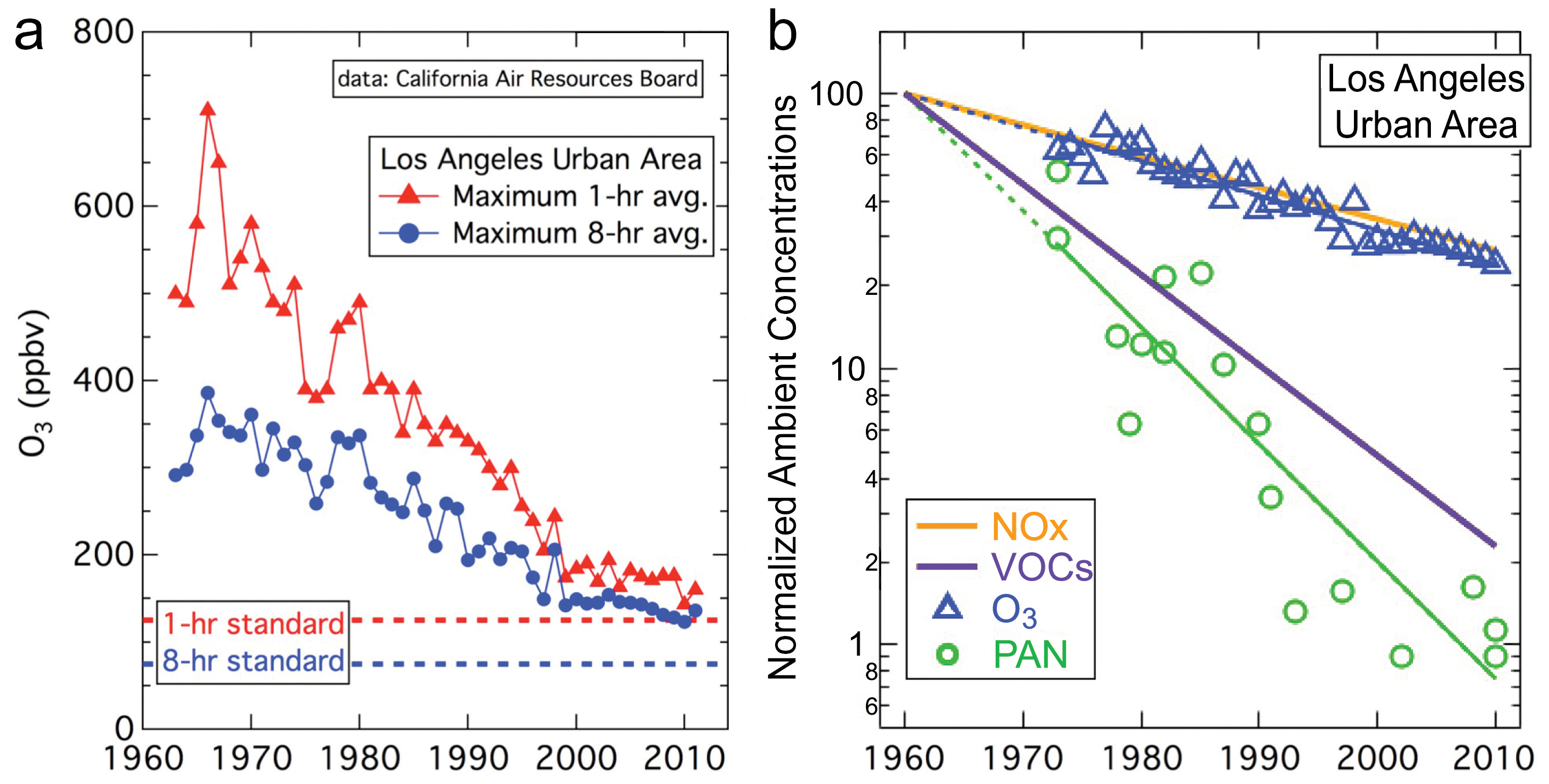
And there has been a massive change in the lower atmosphere … because since the 1970s we have had clean air regulations that massively reduced pollution. However … there is only so much pollution that can be removed from the atmosphere. And as we see in the graph above, pollution was reduced steadily when it was high, but lately since 2000 the change has been lower. And when did “the pause” start … ~1998. However, if we look at the meteorological balloon data, we find no obvious change in trend. However, whilst N.America and Europe have been reducing pollution, places like China have been increasing.
And of course one of the 50 excuses for the pause was:

Global warming slowed by China sulfur pollution

WASHINGTON – Scientists have come up with a possible explanation for why the rise in Earth’s temperature paused for a bit during the 2000s, one of the hottest decades on record. The answer seems counter intuitive. It’s all that sulfur pollution in the air from China’s massive coal-burning, according to a new study.

And if Pollution can halt warming since 2000, then the reduction in pollution since the clean air acts of the 1970s can cause it.

Discussion

I now have several possible contenders for the oddities in global temperatures:

  1. CO2 – which is a relatively small effect
  2. Contrails – which have certainly grown since the 1970s as we need, and affect the atmosphere at 10km which is where we see the change from a warming to cooling trend – but there’s a discrepancy in that the hot spot that seems to be associated with the US is not down wind at the contrail height.
  3. Reduction in pollution, which has certainly massively decreased since the clean air acts of the 1970s – this change has been largest in N.America and Europe (where we get the big hotspots in the trend) and they are downwind at lower level wind directions.
  4. Natural variability – we must not forget, that the scale of natural variation is enough to explain all changes we see. Indeed, the changes in temperature are so slight that anything and everything we see could just be a random occurrence.

The important thing here is that because pollution and contrails are relatively short lived things, there effect tends to be strongest just at, or downwind of the source. And this is different from CO2 which is much longer lived. As such we ought to see characteristic trends associated with specific areas. If the cause of warming is pollution, we ought to see strong cooling downwind from Chinese industrial areas as pollution increased. And we also ought to see strong warming downwind of N.America and European polluters and they reduced pollution. Likewise, with contrails, we ought to be pick up patterns, but in slightly different areas particularly in transcontinental flight routes. So the pattern of warming should be different enough to identify the likely culprit.

CO2 warming

However even with CO2, we know where man-made emission are coming from as shown in the map below:co2_map_big
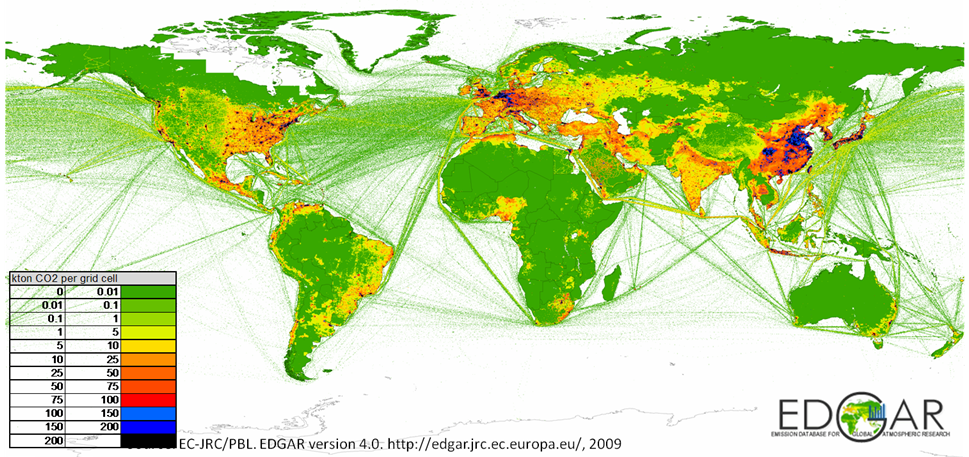
Naively I thought the areas with the highest CO2 would  naturally be the areas with high human emissions. But if we look to see which areas are relatively high or low in CO2 as shown below:
slide24
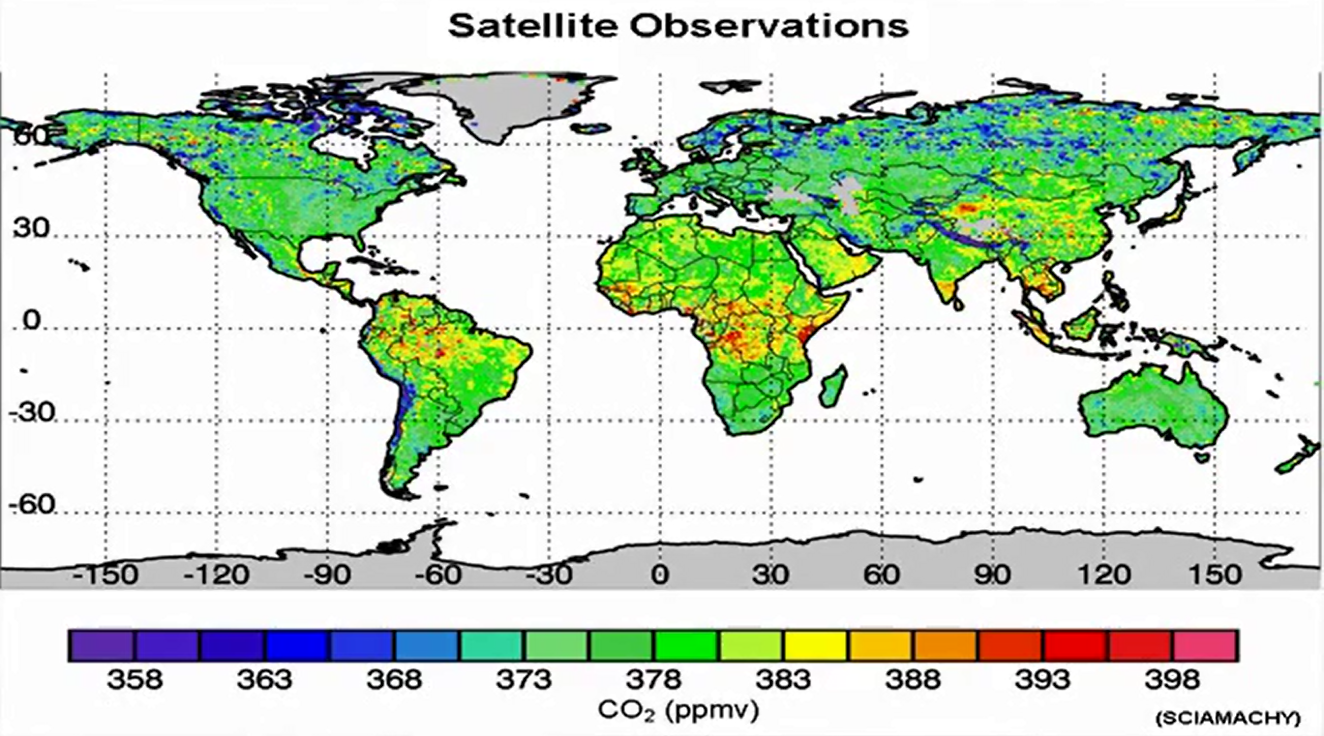
We see that the areas that “lead the pack” in terms of CO2 are central Africa. This suggests these are CO2 sources and those lagging are the northern tundra areas of Alaska and Siberia which are either least emitting or absorbing CO2. If CO2 were having a regional impact, this is the type of patter we would expect, which is very different from the regional hotspots we actually see. However, in defence of the CO2 hypothesis, it is well mixed and we probably shouldn’t expect to be able to discern any regional effects.
 

Posted in Climate | 1 Comment