A year ago Doug Keenan set a very simple challenge to those claiming they knew for certain the world was warming:
If its so easy to detect <1C warming in the last 100 years – A prize for anyone who can identify which simulated run of natural variation from 1880–2014 has had 1C added or subtracted.
Result
Despite the $100,000 prize, there were only 33 entries. Almost all entries were submitted by professional researchers in fields such as physics, computer science, engineering, econometrics, etc. No winning entry was received.
So, for all the nonsense about “global warming being obvious” in the temperature plot, not one of the idiots who say “it’s obvious” … was able to demonstrate their omnipotent ability to correctly spot trends in natural time series when put to the test.
The HYPOCRITES
But well done to those who actually did submit an answer!
Below is the key information, but for more on the competition info from Doug see Contest Remarks
“After the Contest was announced, the Contest time series (1000 series) were analyzed by the statistician Andrew Gelman. Gelman’s analysis is described in a post on his blog. The analysis concludes that a person trained on time series should expect to correctly identify 854 ± 10 of the 1000 series. (Note that identifying 900 series is required to win the Contest.)
“Simply put, correctly identifying fewer than roughly 865 series can be reasonably done without using specialist techniques from the study of time series. Despite that, all entries to the Contest identified fewer than 865 series. Thus, none of the contestants demonstrated any skill with time series. That occurred even though some of the contestants have substantial professional experience analyzing time series.
My Solution
Therefore if I had responded I would have taken a simple average gradient (LR) and picked those with the highest absolute gradient and depending if +ve or -ve have said they were +1 or -1C respectively. But unfortunately, I was missing one vital piece of information: how many had been adjusted.
Therefore, a bit of stats is required. We know the gradients fall into three buckets: those with no addition, those with +1/century and those with -1/century. Within each bucket the gradients should be a normal distribution (if the time series were random), and we know where each should be centred. So it should be possible to estimate the number that were in each bucket. That is just a question of putting each gradient into the most likely bucket. There’s probably some statistical trick for that, and I could have found it, but as Doug would have known this was the likely approach and have checked to ensure a 90% accuracy was impossible using this approach, so I knew it was pointless.
Instead, in order to win the $100,000 prize, it would have been necessary to “move away” from the optimum which would have been checked to ensure the prize could not be claimed, toward a sub-optimum solution which was sufficiently different that there was a small chance that it might have by accident picked the right ones (but most likely would be wrong).
But what if I did win?
It would then put me in a moral dilemma – since I could very well do with the money, I’m very happy Doug ran the competition – but he clearly never intended it to be won – and certainly not by a sceptic.
However, I would still be interesting to see a graph based on the scale of gradient chosen as the cut-off (above which it is assumed +1 or -1C/century added) and what percentage would be right using this very simple approach for each cut-off. I assume the graph would rise steadily as the threshold was increased because at first each increase would identify more right ones than wrong. But eventually the scale would be too large and it would start identifying more wrong than right.
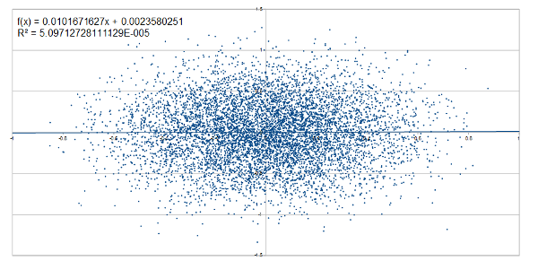
The Top Graph
It’s just natural variation – it’s just as meaningless as the “global temperature” graph.


Using only the gradient, the number of series correctly identified will be less than roughly 865, as Gelman’s post demonstrates. And the actual number is slightly lower.
Note that the non-trending time series (i.e. before the trends are added) are constrained to have greater likelihood than the trending statistical model relied upon by the IPCC (as per the Contest web page). If there was a way to win the Contest, it would presumably rely on that.
Well done for running the competition!
I’ve long been interested in trying to understand the psychology of prediction with random graphs. Quite clearly there are a group of people (aka “scientists) who seem to be absolutely convinced at their ability to divine a trend in data which to other people (“sceptics) does not have one.
And a while back I even searched for the simplest scenario which was a paper comparing the perception of the trend in data with the linear regression. I couldn’t find anything which means that it was either done so long ago, it’s hidden in an ancient journal, or it hasn’t been done.