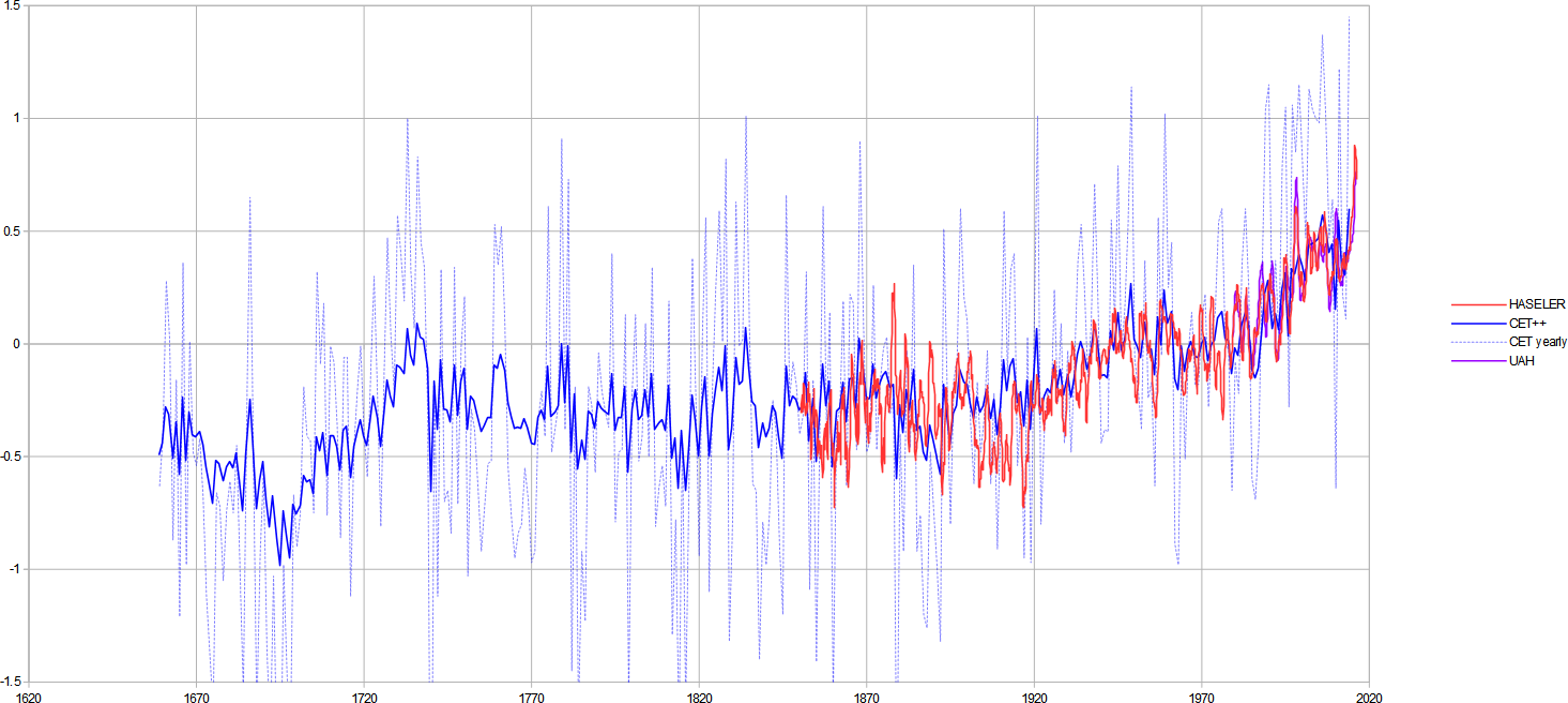
Following the last post I had a go to see what the graph might look like. With a bit of added processing to CET to give it a similar dynamic to the other global temperature proxy datasets, I produced the following curves which are overlaid here:

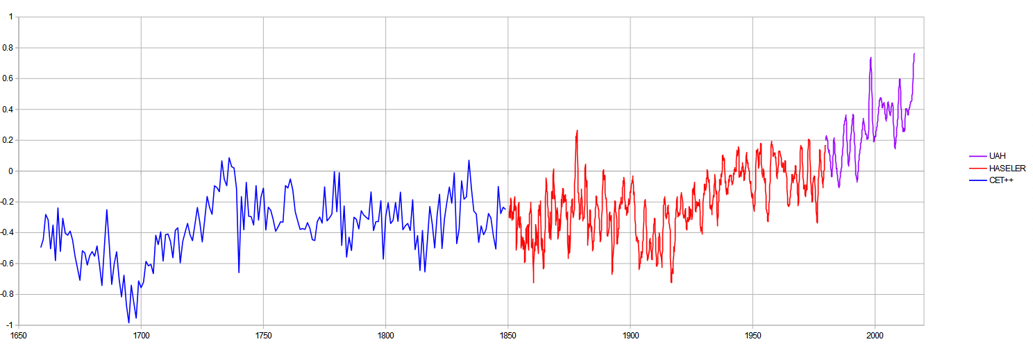
And in one continuous sequence here:

Categories
Archives
- November 2025
- October 2025
- September 2025
- August 2025
- July 2025
- June 2025
- May 2025
- April 2025
- March 2025
- February 2025
- January 2025
- December 2024
- November 2024
- October 2024
- September 2024
- August 2024
- July 2024
- June 2024
- May 2024
- April 2024
- March 2024
- February 2024
- January 2024
- December 2023
- November 2023
- October 2023
- August 2023
- June 2023
- April 2023
- March 2023
- February 2023
- January 2023
- December 2022
- November 2022
- October 2022
- September 2022
- August 2022
- July 2022
- June 2022
- May 2022
- April 2022
- March 2022
- January 2022
- December 2021
- November 2021
- October 2021
- September 2021
- August 2021
- May 2021
- April 2021
- March 2021
- January 2021
- December 2020
- November 2020
- October 2020
- May 2020
- April 2020
- March 2020
- February 2020
- January 2020
- December 2019
- November 2019
- October 2019
- September 2019
- August 2019
- July 2019
- June 2019
- April 2019
- March 2019
- February 2019
- January 2019
- December 2018
- November 2018
- October 2018
- August 2018
- July 2018
- June 2018
- April 2018
- March 2018
- February 2018
- January 2018
- December 2017
- November 2017
- October 2017
- September 2017
- August 2017
- July 2017
- June 2017
- May 2017
- April 2017
- March 2017
- February 2017
- January 2017
- December 2016
- November 2016
- October 2016
- September 2016
- August 2016
- July 2016
- June 2016
- May 2016
- April 2016
- March 2016
- February 2016
- January 2016
- December 2015
- November 2015
- October 2015
- September 2015
- August 2015
- July 2015
- June 2015
- May 2015
- April 2015
- March 2015
- February 2015
- January 2015
- December 2014
- November 2014
- October 2014
- September 2014
- August 2014
- July 2014
- June 2014
- May 2014
- April 2014
- March 2014
- February 2014
- January 2014
- December 2013
- November 2013
- October 2013
- September 2013
- August 2013
- July 2013
- May 2013
- March 2013
- February 2013
- January 2013
- December 2012
- September 2012
- May 2012
- April 2012
- March 2012
- February 2012
- January 2012
- December 2011
- November 2011
- October 2011
- September 2011
- August 2011
- July 2011
- June 2011
- May 2011
- April 2011
- March 2011
- February 2011
-
Recent Posts
Recent Comments
- John on Michelle Mone
- John on Where did the internet go wrong?
- John on What would Jesus do?
- Nuclear War (lists) | Scottish Sceptic on Nuclear War
- Scottish-Sceptic on The stagnation of innovation
Archives
- November 2025
- October 2025
- September 2025
- August 2025
- July 2025
- June 2025
- May 2025
- April 2025
- March 2025
- February 2025
- January 2025
- December 2024
- November 2024
- October 2024
- September 2024
- August 2024
- July 2024
- June 2024
- May 2024
- April 2024
- March 2024
- February 2024
- January 2024
- December 2023
- November 2023
- October 2023
- August 2023
- June 2023
- April 2023
- March 2023
- February 2023
- January 2023
- December 2022
- November 2022
- October 2022
- September 2022
- August 2022
- July 2022
- June 2022
- May 2022
- April 2022
- March 2022
- January 2022
- December 2021
- November 2021
- October 2021
- September 2021
- August 2021
- May 2021
- April 2021
- March 2021
- January 2021
- December 2020
- November 2020
- October 2020
- May 2020
- April 2020
- March 2020
- February 2020
- January 2020
- December 2019
- November 2019
- October 2019
- September 2019
- August 2019
- July 2019
- June 2019
- April 2019
- March 2019
- February 2019
- January 2019
- December 2018
- November 2018
- October 2018
- August 2018
- July 2018
- June 2018
- April 2018
- March 2018
- February 2018
- January 2018
- December 2017
- November 2017
- October 2017
- September 2017
- August 2017
- July 2017
- June 2017
- May 2017
- April 2017
- March 2017
- February 2017
- January 2017
- December 2016
- November 2016
- October 2016
- September 2016
- August 2016
- July 2016
- June 2016
- May 2016
- April 2016
- March 2016
- February 2016
- January 2016
- December 2015
- November 2015
- October 2015
- September 2015
- August 2015
- July 2015
- June 2015
- May 2015
- April 2015
- March 2015
- February 2015
- January 2015
- December 2014
- November 2014
- October 2014
- September 2014
- August 2014
- July 2014
- June 2014
- May 2014
- April 2014
- March 2014
- February 2014
- January 2014
- December 2013
- November 2013
- October 2013
- September 2013
- August 2013
- July 2013
- May 2013
- March 2013
- February 2013
- January 2013
- December 2012
- September 2012
- May 2012
- April 2012
- March 2012
- February 2012
- January 2012
- December 2011
- November 2011
- October 2011
- September 2011
- August 2011
- July 2011
- June 2011
- May 2011
- April 2011
- March 2011
- February 2011
Categories
- #GE2019
- 1/f
- Academia
- ADE
- Advanced Greenhouse Theory
- bbc
- Caterpillar
- Climate
- Cllimate Cult
- computing
- Coronavirus
- Covid
- Economics
- Enerconics
- Energy
- Environment
- Fails
- FGill
- Funding Imbalance
- General
- Geology
- Goat Toads
- greenblob
- History
- Humour
- Ice age
- internet Revolution
- Kyoto
- Light
- Media
- media
- My Best Articles
- Politics
- Proposals
- Sceptics
- science
- Scotland
- SO2
- Solar
- Survey
- transport
- UK
- Ukraine
- Uncategorized
- Wind
Meta


Pingback: Understanding the Global Temperature V – Met Balloon Data | Scottish Sceptic
Pingback: Understanding Global Temperature VIII – It was the greens wot warmed us!! | Scottish Sceptic