 I was reading Bob Tisdale’s blog Absolutely Amazing! A Climate Scientist Writes a Blog Post about… in which he discusses a post on unRealClimate, in which unRealClimate discuss Anthony Watts blog’s widget. (right)
And I was looking forward to seeing how they would replace the widget. Obviously it would turn from blue to red, their graph would highlight 1970-2000 and “hide the pause” afterwards, etc.
Lewandowsky
But first to explain, I need to step back and talk about the work of a certain Lewandowsky before he gave up any credibility to fabricate evidence against sceptics.
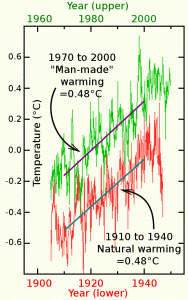
Comparison of warming from 1910-1940 with that of 1970-2000 showing exactly the same warming. The 1910-1940 is mainly natural variation showing the same scale of natural variation even if ALL the warming from 1970-2000 were manmade.
I came across him when trying to find research into the interpretation of graphs. Take e.g. the graph to the left. Here we have a simple graph comparing the global temperature between 1910 to 1940 and 1970 to 2000 showing that they have the same trend.
As I produced the graph I know the trends were created using a linear regression – an accepted way of adding such trends.
However, notice that I’ve drawn in two lines and how the lines emphasise the slope and suggest the whole green set of points can be represented by one line and the whole red set by another.
Now the question I wanted to answer was this: if I didn’t use a linear regression but instead drew these lines by eye, how “accurate” would I be and do those with a scientific degree tend to draw the line in a particular way. In other words, does expertise tend to predispose people to interpret the graph in a particular way.
And unfortunately, the only person I found who had done any research vaguely in this area is Lewandowsky, who for ethical reasons I would not approach. (Although I nearly did until I realised it was odd that an academic in Bristol and one I assumed was in Australia, should have the same name).
 The Hypothesis
The hypothesis I formed was that somehow people learn to interpret graphs as if they are blurred images.
How many times have you noticed that the world looks blurred like the image to the right? The answer for most people is that we almost never see the world as being blurred but instead believe we see it as a set of very sharp images. But the reality is that any view with objects at more than one distance will have some or all the objects out of focus as per the above diagram.
But the image we receive in our mind is one that is almost always crystal clear with all the blurriness which must exist in real life removed before we can “see” it. We in fact do not see the world directly but instead see a processed form of the world which has been pre-processed to removed the blur.
Now my hypothesis is that somehow when we interpret graphs such as that above, we tap into this ability to restore “sharpness” from “blur” so that we look at a graph of noise and just as we do not see blurred images, our brains can pre-process the images of the graph so that we do not see the noise only the presumed “line” behind the blur.
But the real question is this: do those taught a science degree and those taught an engineering degree process the same graph in slightly different ways so that sometimes, depending on our training and education, we each see very different things in the same “noise”.
1/f noise
And this becomes very important with 1/f noise. Because unlike white noise (the type most scientists are taught about), 1/f noise is full of long period deviations. So, the entire curve below is 1/f noise.
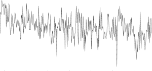 So taking the curve to the right. This clearly contains a lot of short term noise which we in science are taught “blurs” the actual signal. So, the short-term variations in some way obscure “what should be there”. Do we treat this like an actual blurred image and use our innate ability to see sharp objects clearly to “see through” what we interpret as blur.
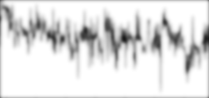 We can even force ourselves to use this “deblurring” ability by screwing up our eyes and peering at the graph. Or if that is too difficult, you can look at the blurred image to the right. We no longer see the high frequency noise, instead we focus on lower frequencies and we tend to imagine a line through the middle of the blurred parts and begin to interpret the graph as a long continuous plot.
So, are we taught to “see” this. And if so are scientists and engineers taught differently and see different things?
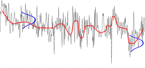 Typically a science student will be taught about high frequency white noise which adds a random offset to each point as suggested by the curves in blue. This means we scale the “blur” which we take to be a probability distribution so that the we look through the high frequency noise/blur at the image and my hypothesis is that we somehow adapt the system by which we see the normal blurred images inherent when viewing objects, sharply. So we automatically (without the ability to stop ourselves) create a sharp image akin to the line in red shown above right.
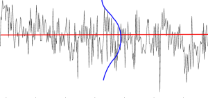 However, for those, like engineers, that are used to dealing with 1/f noise, flicker noise, perhaps our training and experience with real-world noise and variation gives us the ability to interpret the graph not only as if it has white noise such as the one above but also we appreciate that plots can have much longer period noise so that we see the “blur” as being a very large long-term distribution around the image as show to the right..
unRealClimate
So, one of the most interesting questions I have regarding climate is whether the whole climate debate may be because one group of people are trained to view graphs one way and another another way. That might explain why we both present the same graphs but can never agree what they mean. What looks obvious to one side looks frankly ridiculous to the other – just because we are trained and/or have the experience to see different perspective of the same data. Almost literally, we both put up the same graphs and each literally see different things.
And if we are seeing different things and cannot “see it from the other view”, perhaps this is why there are so many accusations of lying cheating “being in the pay of Big Oil (Wind)” etc.
And there’s very strong evidence for this from the arch fabricator Lewandowsky (who did fabricate evidence against sceptics so deserves that title). In a survey in Australia he found that sceptics interpreted the same graph the same way whether or not they were told it was stock market shares or climate. In contrast alarmists changed their view depending what they were told to expect. (Of course he didn’t report it that way!)
So, this shows that sceptics tend to have an objective interpretation of graphs whilst alarmist have a subjective “consensus” view which changes depending on the context.
Obviously, I’d love to repeat the trial and this time go into depth trying to see whether this difference also extends to the way different types of noise are interpreted. But that isn’t practical. However that left the question answered as I couldn’t find data on how alarmists interpret the noise within these global warming graphs.
But, when I read this comment at unRealClimate I thought “Gotcha“. I’ve finally got something that reveals their thinking when seeing this noise.
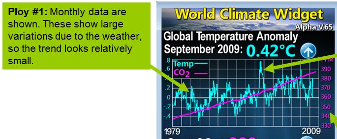 There’s not a lot to go on, so I have to pedantically go through this almost word by word trying to tease out information on their viewpoint of this noise.
| Monthly data are shown | They refer to the short term, high frequency noise. So they have a concept of this short-term noise. |
| But it’s interesting that they use the words: shown, show and looks. All visual.Also | |
| These show large variations due to the weather | Notice how they explicitly separate out for special treatment this short term “variation” of the graph when the Lorenz spectrum of climate variations which spans the entire spectrum from shorter than a day to “ages”. |
| So the trend looks relatively Small | And then notice how they totally ignore (and therefore seem to have no concept of) any form of long term variation and explicitly refer to it as a trend and not a variation. |
I find the contrast “noise is shown” and “trends look” quite interesting. There is an implication that the graph is drawn this way in order to hide the trend. I’ve come across similar words being used about Salby’s graphs that somehow they were misleading when I could see no trickery at all being used.
The key to understanding this seems to be how “large” variations are contrasted with “small” trends. They are implying that the “noise” is too large and intentionally being used to hide the small “signal”. In fact the trends must also contain noise (or more likely are largely noise). In effect all they are really doing is asking for short-term variations to be smoothed so that they can see the long term variations. But they don’t see it this way. The long term isn’t “variation” but “trend”. It isn’t “noise” but “signal”. I’ve never seen any justification for this so it appears to be a very strong almost subconscious belief amongst alarmists (at least those who can read graphs).
But why set an arbitrary cut of at one month? Why not a year a decade a century a millennium? As Lorenz says there are many scales of variation and none are more or less important than others. You cannot just arbitrarily say that below one month is noise and above it is trend – or at least if you do you get non-science./
However the author here clearly has created in their mind some kind of hierarchy of “validity” for one part of the Lorenz variation compared to another.
Conclusion
There is clearly a demarcation in the mind of the alarmist between short term variation which they view as “Noise” and long term variation which they see as “trend” and no indication that they are aware the two are quite likely the same.
I’ve never seen any evidence they have anything but a very simple understanding of noise and there’s plenty of evidence they can’t “see” anything once their interpretation of massive doomsday warming takes over their minds.
So, on the face of it, the evidence so far supports the hypothesis that in some way training, experience, inability to read graphs, lack of understanding of different forms of variation is preventing them seeing what sceptics are able to see.


Pingback: RealClimate’s deceptive graphs | The IPCC Report
This is enlightening for me, as it overlaps with some technical problem-solving issues.
You imply I need to make disclosure:
I’ve learnt to justify a trend before calculating it. When I view (say) the 20th-century surface temperature, I see bounded trends (ie not persistent) which may have an assignable cause.
Perhaps half of such inquiries turn up nothing (supporting your 1/f model), but I persist because I can tolerate some false-positives, but no -negatives.
So, I see the “signal”, but as possibility, not fact. Having a foot in each camp, I misunderstood the blinkered views used on both sides of the debate.
Aha.
Seen from outside, those operating a process often have curious ideas about what they do. This conventional wisdom is characterised by consensus, effectiveness in addressing normal problems, but dangerous when the process is in an abnormal state.
Any attempt to dispel this conventional wisdom by good hard science is a mistake. The usual outcomes are either an obdurate adherence to the old way, or utter confusion and incapability. (sound familiar?) “In the kingdom of the blind, the one-eyed person is pathological”. I emphasise that I’m describing perfectly normal people, who should be treated as such.
All this suggests that the root problem may be one of continued education, so not easy. When did you last persuade (say) a PhD that they had something to learn? I hope you’re in for the long haul.
This neatly explains why so much well-reasoned “skeptical” argument is ineffective: It’s presented (or perceived) as *training*, which doesn’t serve.
Peter, I know where I was standing when my perception of the climate graph changed. I might even have had it upside down at the time. It’s like those vase pictures that can also be two women facing each other. Sometimes I see one, sometimes the other.
You talk about PhD’s not liking being told they need trained. I think it’s more deep rooted than that.
I came across a similar situation to climate in archaeology. Here amateurs were going out with metal detectors and finding ancient artefacts. At first I assumed it was merely that they didn’t like the ones that broke the law. But when I defended those who didn’t break the law on a forum I was ruthlessly attacked. As I’m neither a professional archaeologist nor a metal detectorist, I was fairly neutral and it seemed to me that most archaeologists and metal detectorists had been responsible for some quite horrific damage to sites.
Eventually I worked out that what I was really seeing was a “demarcation dispute”. That is to say, the archaeologists saw archaeology as something they were in charge of, and they bitterly resented these amateurs coming in and taking over. So, many were literally taking every opportunity to attack metal detectorists where ever they could. Indeed, the behaviour I saw tended to be mature male professors egging on young “hot-heads”. So, on the forum I was attacked by young males, but the people condoning their activity were older men.
This struck me as being very similar to ape like behaviour where troops of chimpanzees e.g. would strut around sometimes individuals making bravado attacks on the opposing troop and if not they would make a lot of noise bend trees (at least this is similar behaviour in gorillas).
So, in effect the forums are the areas where males strut around making a lot of noise and trying to intimidate the opposing troop.
And I feel this does explain a lot of the behaviour seen by warmists. Because the sites which get the strongest attacks are not ones which spout politics, but those that talk about climate science. And so it seems to me, that what most antagonises the warmists is that people like Anthony Watts are taking it upon themselves to publish scientific material on the climate without being part of the academic club – who feel they “own” this area.
Your distinction between scientific and engineering minds seems to be plausible. However, I believe that there is a bigger issue at play here. Climatology starts from the central premise of catastrophic global warming is correct. That means that anything that confirms the hypothesis is treated as correct data, whilst anything that contradicts it is either incorrect data, or just noise.
On the subject of Lewandowsky, it is worth reading his blog biography
“Professor Stephan Lewandowsky is a cognitive scientist in the School of Psychology…
His research covers a number of issues, among them the role of scepticism in memory updating and the distinction between scepticism and denial; the way in which people process uncertainty surrounding climate change; and the normative implications of scientific uncertainty in the climate system.”
Lewandowsky is an expert on how people interpret graphs. An example of how he has used this as a propaganda weapon was when he co-authoured a paper this year on explaining the discrepancy between climate models and the pause. Lewandowsky’s contribution seems to have been in smoothing out the pause. They produce a temperature graph derived from HADCRUT4 where temperatures in 2006 still seemed to be rising at over >1.5 Kelvin per century. This was in three steps, that I was able to replicate.
1. Using the Cowtan & Way modified HADCRUT4 series.
2. Using decadal changes in temperature anomalies.
3. Using 15 year centred moving averages.
http://shapingtomorrowsworld.org/bio.php?u=22
http://manicbeancounter.com/2014/08/07/the-lewandowsky-smooth
Someone like Phil Jones did what he did without intending to cause harm to anyone. Lewandowsky on the other hand set out in a premeditated way to do harm to people.
To emphasize your point, it would be worth reading the “Debunking Handbook” that Lewandowsky co-wrote with John Cook.
http://www.skepticalscience.com/docs/Debunking_Handbook.pdf
It starts with
“It’s self-evident that democratic societies should base their decisions on accurate information. On many issues, however, misinformation can become entrenched in parts of the community, particularly when vested interests are involved. Reducing the influence of misinformation is a difficult and complex challenge.”