I have been developing a model to try to predict the effect of coronavirus (CV) in Scotland. I will go through each point. CVModel
Disclaimer, I make no guarantee this is correct and it is provided as is, intended only as a discussion document containing my own best guess. It must be checked to ensure validity and suitability by others.
Assumptions of model
This model assumes that the population is divided as follows:
- unsusceptible – which is a group that never get the virus. I have assumed 20% of the population will not get the virus.
- visible infected – which is the group that correspond with the “number of tested positive cases”.
- Invisible infected – which are people who have the virus but whose symptoms are so mild that they do not pro-actively seek to be tested. (2+3 = total population -1)
- Hospitalised – consists of those who required hospitalisation (in Wuhan – which may not be the same as the UK)
- Intensive Care – I am extremely dubious as to what this actually means. It seemed to mean “requires ventilation”, but I’m not sure what that meant in practice and in particular I am not certain the definition used in Wuhan matches the UK definition of “Intensive Care Unit”.
- Death – I believe means “having been tested for CV and being found positive and then dying”. I presume this doesn’t include people who die and then the death is later attributed to CV?
I have tried to keep the model as simple as possible. It assumes that the growth rate is constant which means an exponential growth in an unexposed population, but because the uninfected population begins to drop as more and more people get infected, the rate of growth drops in proportion.
Population
5300000 from census data
Growth Rate
This is the key term governing the growth rate of infections. Unfortunately it is one of the most difficult because initially the rate of growth in cases can be governed by a growing awareness that CV is present – or even a lack of CV testing kits.
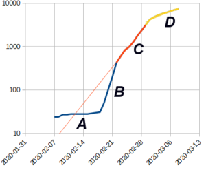
Growth of Cases (S.Korea)
The number of cases in S.Korea, shows many of the typical features present in many growth curves. I interpret them as follows:
A – represents the cases that are “self-reporting” as travellers who may be exposed to CV and become ill ask to be tested.
B – represents a “catch up” phase, where people who previously had not thought their symptoms were due to CV were tested “in a hurry”
C – represents what I believe is a period of “free” growth in cases. In S.Korea this rate was 0.28.
D – this is a lower rate that occurs around a week after very extensive measures are taken to curtail further growth. The rate of growth here is highly dependent on the measures taken. Also it is worth noting that between implementing measures and any response, the number of reported cases will increase approximately 10x.
Looking at current rates, the UK is 0.3. Before measures took effect S.Korea had a rate of 0.27, Italy 0.27, France 0.34, US 0.35, Spain 0.37, Germany 0.3. The main outlier is Iran at 4.5 but the data from Iran is poor quality.
So, from looking at the early rates, the most common rates in the “developed” phase when people are being tested and no controls are in place appears to be about 0.3 (10x in 7.5 days). However it could be as high as 0.35 (10x in 6.5days) and modest controls may reduce it to 0.25 (10x in 9 days)
Unsusceptible
This 20% figure is based on statements suggesting “up to 80% of population may be infected”
Visible fraction
The death rate amongst those being infected was about 1 per 40 to 50 cases outside China and S.Korea and cruise ships. In contrast in S.Korea and the cruise ships which were actively seeking out infected people the figure was closer to 1 death per 180 infected. Because people who die tend not to be missed by the medical system but those with mild cases are, this suggested that pro-active testing was finding 5x as many people as reactive testing of people for CV. However S. Korea and the Cruise ships were not the same. We expected thorough testing on the cruise ship but not everyone in S.Korea was being tested and a cruise ship usually contains a lot more older people.
But more importantly despite removing all that were infected in S.Korea from the general population, the affect on growth rate in S.Korea was only to approximately halve it. That suggests that half the cases were still being missed or that for every infected person there were about 9 people who were not. That suggests a 10% rate. But then I realised that the reason why there were so many extra infected people, was because there was a delay between infection and being reported as infect. Even a few days means that by the time a person if reported as having CV, the number of people with CV who are not visible has increased. This is how I came up with the estimate that visible cases represent 20% of total cases when they are infected, and 10% when they are reported.
Over 60s => Age intensification
In China about 11% of the population are over 60 whilst in the UK about 18% of the population are over 60. That suggests the increase will be 18/11 (1.6x) the scale. However, people live longer because they are healthier, so it could also be argued that older people in the UK will be less susceptible. In the end for the Age intensification factor I simply took the square root of 18/11 (which effectively halves the rate increase due to the higher number of older people in the UK). This factor increases hospital beds.
Hospitalisation
This is based on the 20% figure from Wuhan and represents the number who landed up in hospital. However it is possible this figure might represent “isolated individuals” rather than people being treated.
For simplicity I’m assuming ICU is part of those hospitalised. However, since I’m also assuming different delays this is rather a “botch”. But I don’t have enough information to make it more complex.
ICU of Hospitalised
This represents the fraction of those who were hospitalised who ended up in “intensive care” in Wuhan. I am not sure this directly converts to “ICU” beds as the term in used in the UK.
Delays
These represents a time delay between one column and another. For simplicity I’ve used a function that the delayed column is
Delay_column = (1/delay) * original_column + (1-1/delay) * previous_delay_column_value
This does give an average delay between the columns of the specified time, but if means a sudden large drop in cases still leaves a “trail” of cases in hospital well after the event. However since we have no long term data to know what will happen and nothing at all on what happens if the pandemic is allowed to “naturally fall off” there is no way this prediction is anything but a guess.
The delays I’ve given from the available reports are
Hospital = 5 days (time from infection to being hospitalised)
ICU delay = 10days (time from infection to being in ICU)
Death
I have struggled to make sense of the data on deaths. In Wuhan during the rapid rise, they were finding about 2% of those reported with CV were dying. Because I’m assuming a delay, the deaths in terms of those infected needs to be higher because by the time someone dies, a lot more people are infected. However there is also a delay in reporting people as infected. Unfortunately, whilst the uncertainty in these figures are only a few days, because the figures double roughly every two and a half days, a small difference between the delays makes a huge change in the figures.
Eventually I picked a delay between infection and death of 7.5 days and a rate of death of 3%. This gives approximately the 2% death rate against current reported cases.
Spreadsheet
I will go through the columns
Date
is the date corresponding to the row of data
Day #
Is the number of days from day 0
Simple projection
Is a simple exponential increase (y = exp(rate*day#) starting from the assumed first day of the outbreak. Note this “simple” because it does not take into account the slowing of the epidemic as more people are infected. The value is the nominal number as would be shown as “infected” in statistics, not the presumed total (including those carrying infections that will not normally come to official notice). However, there is a “report delay” between infection and the actual reported number of cases.
Population Rise (ignoring infected)
This is the daily increase in the “simple projection”
Rise in reported cases
If the rise doesn’t calculate as negative, then this is the simple population rise x the fraction of population remaining who can be infected. The remaining population is total population, less those who have been infected, less the fraction who will not be infected.
Total to be reported infections
Is the sum of “rise in reported cases” (note this is reported not those infected). Note this figure precedes reported infections as the number of reported cases are assumed to be delayed.
Actual total infected
This is the total reported infections divided by the faction of cases that are normally visible
Delayed reported infections
Is the Total reported infections with the added “report delay”
New beds
Is the rise in cases scaled by the fraction which is hospitalised
Occupied beds
Is increased by the number of new beds, but then reduced by a function that means people spend the average time in hospital
Delayed occupied beds
Is occupied beds with the hospital delay
New Critical beds, beds occupied and Delayed occupied critical beds
As per above but for critical beds. Note these two figures are independent and use two different delays and periods. Therefore although total beds is considered to include critical beds, it is possible that the calculated number of critical beds exceeds occupied beds.
Deaths, delayed deaths
Total deaths is calculated from the “total to be reported infections”
Results
Unless otherwise specified, the following graphs are for a rate of rise of 0.3 (7.5 days per 10fold increase)
Total Scottish cases
As this is modelled as an exponential increase, the predicted rate of ise is a straight line until most of the population has been infected and then it plateaus.
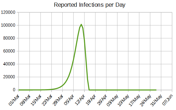
Reported infections per day
Shown as number of infections per day, the rise is barely discernible until the 22nd March and then rises rapidly to a peak around the 10th of April. This model then shows the number of infections dramatically declining, but realistically it would be more gentle.
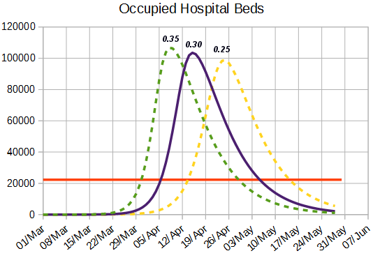
Occupied Hospital beds
This shows the number of hospital beds that are required together with the number of hospital beds before the epidemic started. The different curves are for fast (0.35), UK average (0.3) and slow (0.25) projections. As can be seen there is a dramatic shortfall with about 5 coronavirus patients and 1 other patient needing each bed (as beds were nearly full before the epidemic started)
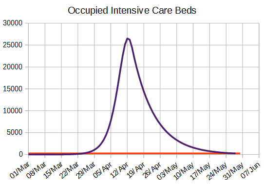
occupied intensive care beds
This graph shows the number of ICU beds. As can be seen this is so much greater than was available that the figures cannot be compared. However, it is not clear whether the Wuhan definition of acute care matches that of ICU as used by the UK so the figure may not be comparable.
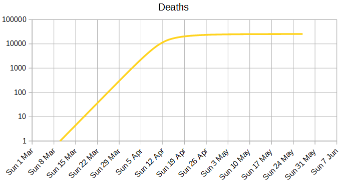
Deaths
This is my predicted number of deaths in Scotland.
Stats
The following table shows the days at which the number of predicted beds reach 10%, 50% and 100% of the number of NHS beds before the pandemic. The peak is the day with the highest demand and the peak beds the number of beds that would be required for everyone with coronavirus who needed a bed to have one.
|
Growth rate |
10 fold |
10.00% |
50.00% |
100.00% |
Peak |
Peak Beds |
|
0.25 |
9.21 |
5 Apr |
11 Apr |
14 Apr |
25 Apr |
99000 |
|
0.3 |
7.68 |
29 Mar |
3 Apr |
6 Apr |
15 Apr |
103000 |
|
0.35 |
6.58 |
24 Mar |
29 Mar |
31 Mar |
8 Apr |
107000 |
NHS Advice
