Note: the comments on height and the greenhouse effect are not accurate. Please see next article for a better description
Summary so far
In previous articles, I have tried to work out to what extent I can produce a global temperature which is free from the “thumb on the scales” as Dr Bates referred to NOAA’s own attempts to get rid of the global temperature pause. There are also indications that NASA have been trying to get rid of the 1970s cooling.
I am reasonably confident that the satellite data is the best available global temperature we have. This is because it is the only sensor where we have a known quality standard and traceability of calibration back to recognised standards. In contrast, from my own experience, I know that ground sensors have huge problems, and there is a complete lack of quality control which would make even a chocolate chip manufacturer squirm.
So, far I have identified an apparent yearly increase in land surface temperature apparently starting in 1970. I have proposed a way to remove this and was at the stage of comparing my proposed solution with available temperature sets when I went to look at Meteorological balloons.
Meteorological Balloons
I downloaded the data from NOAA and produced this.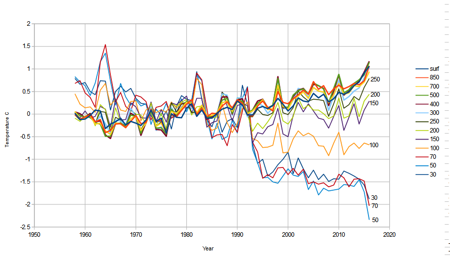
Something is very odd with this. All the layers above 300mb (9km) are cooling and the higher ones most and the lower layers are warming. Could this be the signature of global warming? According to the Noddy theory of global warming, CO2 traps IR, so this, Noddy researchers might conclude is the signature of greenhouse gases: the heat is trapped in the bottom of the atmosphere and so there’s no heat for the top.
According to the real science of greenhouse gases, heat is emitted from a profile. Below are several profiles for various concentrations of greenhouse gas. For all reasonable purposes, all that happens if we increase greenhouse gas, is that we shift the profile up or down (right or left as drawn). A doubling of CO2 is equivalent to about 150m change, so all that happens is that the IR is emitted from 150m higher.
 This means that if the temperature of the atmosphere is falling, we expect the IR to be emitted from CO2 molecules at a lower temperature. Thus the average temperature of the air rises. However, if the CO2 molecules are in an area of the atmosphere where temperatures are rising, the IR will be emitted from a molecule of a higher temperature. More energy will be emitted and atmospheric temperature will drop. So, let’s look at the atmospheric temperature profile:
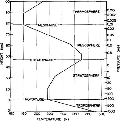
From this we can see that there is a lowering temperature up until around 200mb (10km). Then no change up 20km (~50mb) then rising temperatures up to ~47km (1mb). How does this compare? I’ll give you all the profiles for all the different zone in one graph:
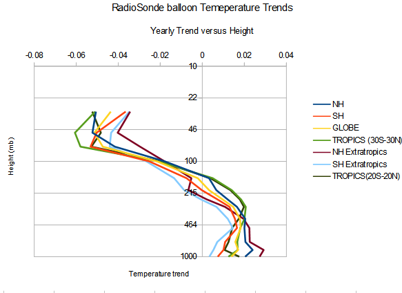 Well we do get warming in the lower atmosphere reducing down to zero at 200mb. However, if we note the temperature profile above, there is no net change in temperature from roughly 200mb up to 20km (50mb). So if the above profile were caused by greenhouse gas – or a simply raising of the emission curve, then we’d expect the lines to be bumping along the axis from 200-50mb and only then turning negative.
Furthermore, we’d expect the whole globe to experience the same warming, but note how the Northern hemisphere (brown) is warming most and the southern hemisphere (light blue) is warming least. Again, this suggests that whatever is changing is a land-based change. However, this could mean the sea is acting as a heat sink.
The tropopause is also higher in the tropics and so it’s interesting to note that the curve for the tropics changes the sign of temperature trend at the highest point.
Comment
On the face of it, this might look like a “signature” of greenhouse warming and it certainly does in the lower atmosphere. But the changes in the upper atmosphere are simply inconsistent with a greenhouse warming effect.
The only way to make it compatible, would be to suggest that Greenhouse gases have dramatically altered the atmospheric curve – but there is no reason for this.
An alternative scenario is that there is some other effect perhaps solar or evaporative cooling changes that account for the curve.
The solution
The answer is simple: “noddy physics”. As I keep saying: the noddy theory of greenhouse warming says that IR is blocked, and therefore it predicts that the lower atmosphere will warm and the upper atmosphere will cool. That there is wrong, because the greenhouse effect works different. However, if something else were blocking outgoing IR, then we’d get the same effect.
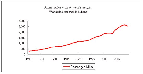
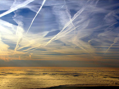
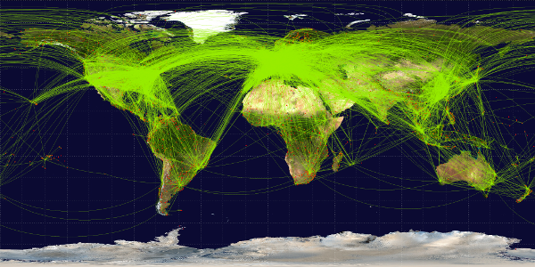
And we can even say where this blocking must be occurring: at the 200mb or 10km level – particularly over land. And when I search “What Is the Altitude of a Plane in Flight?” I get the answer: 36,000ft or 10.8km (ooops!!). And what do I see when I look for worldwide passenger miles?
 I what do I see when I look up everyday:
And which part of the world do people tend to fly in:
And what happens when you remove those contrails:
for three days after 9/11, that’s exactly what happened when all commercial flights were grounded. A team led by David J Travis of the University of Wisconsin-Whitewater took the necessary measurements, crunched the data and published the findings in the journal Nature.
The result? DTR did indeed widen by a full 1°C during those three days, in distinct contrast to the three days before the grounding and the three days after flights resumed. BBC
In the Northern hemisphere we are seeing about 0.027C/year rise in temperature at ground level. That change from 1970 to 2009 is about 1.02C. That is very close to the 1C change recorded after 911. Whilst the two temperatures are different, we certainly have the right scale of change from aircraft contrails,
Conclusion
Met balloon data shows warming of the atmosphere that is incompatible with Greenhouse gases. Instead it is compatible with a form of blocking occurring at 10km, the height at which aircraft fly. The author is not aware of any other known changes at this altitude.
The rate of increase is compatible with the increase in global passenger miles, the greatest warming is occurring in the geographic locations with the most flights and the scale of warming is comparable with the change that occurred when US aircraft were grounded after 911.
It is therefore extremely likely that a substantial amount if not all the warming seen in the land-based datasets, which particularly affect temperatures in the northern hemisphere is due to aircraft con trails.


readreadread before talktalktalk
you will have to draw your own conclusions, but before bbabbing about what this-or-that theory apparently claims, please first read up with the current theori.
Ever heard of (A) the Ozone Layer, (B) changes in ozone in the Ozone Layer, (C) about what ozone does with solar radiation (D) what would happen given changes in ozone in the Ozone Layer and (E) thought about first looking for papers discussing the matter of changes in temperature with height?
Noddy theory, shoddy analysis
Thank you for your comment – as far as I can see they don’t seem to be relevant but as you don’t explain your thinking I can’t really say.
If you would care expand I would be interested to read your thoughts.
… you’ve not come back, so I will second guess that you must be thinking of the Ozone layer at 20-30km (<50mb). However the effect as I describe in the text is at 10km (~200mb). The only way your comment could be relevant is ifthere's a layer of Ozone forming at 10km over land. If this is your point, then I'd be interested to know the source you're referring to.
Following your comment, I realised there was no link to the Greenhouse Theory to explain the terminology “Noddy theory”. I’ve now created a new page just for you:
http://scottishsceptic.co.uk/greenhouse-effect/
Pingback: Revised Temperature prediction | Scottish Sceptic
Huh. Paradigm shift?
I could say something grandiose about letting the evidence speak and what is importance is science – however my first thoughts were “thank goodness alarmists don’t read this – and even if they do, they’ll never listen to anything that isn’t “CO2 done it” – and I’ll be safe from WUWT as Anthony Watts bans any mention of contrails”.
Paradoxically, because it now explains the recent lack of correlation between solar and global temperature, not only does it say “we done it” (a bit) … but it also shows that “the sun was wot done it”.
yup. How long have we flown jets for commercial aviation? I am old enough to remember the ill-starred Comets where aviation engineers discovered the malign effects of metal fatigue. The Comet started flying in the early 1950s, which sort of lines up with the whole rise in atmospheric CO2 thing. Coincidence? I find your contrail hypothesis to be rather appealing as it appears to be explanatory. I wonder how much CO2 the aviation industry has contributed to the atmosphere.
However a few sobering thoughts. Proportionately green supporters flight more often than supporters of other parties. Journalists just love flying, as a profession academics are always flying off to conferences and world leaders are notorious for the aviation miles. (non-scientific) Sceptics will hate the idea that humans may have an impact on the climate, and alarmists will hate the idea that it’s not CO2.
There’s only one group who’ll be interested and that is those who are only interested in the science!
Also – I was starting to see ominous potential for massive cooling – but now, unless we suddenly stop making contrails we should be fine. So it’s stopped me worrying about an impending ice-age!!