(How SkepticalScience views global warming – one way only)I don’t usually deign to ever use the GISS “temperature” graph because it’s fraudulent. However, when I saw a graph of temperature trend on WUWT
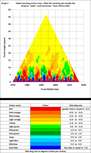
I immediately realised that whoever wrote the article failed to understand the nature of natural variation. They had produced a plot showing the trend on GISS giving a colour for the trend over different periods. And had plotted the colour by the mid date of the trend (X-Axis) and length of the trend (Y-axis) and produced this (right):
But because most of what we are seeing is natural variation, and a variation of 40years is as likely as 20 years is as likely as one over 10 years. The way they had put the graphic together meant that the colour scheme was overwhelmingly dominated by the long term noise (25+ years).
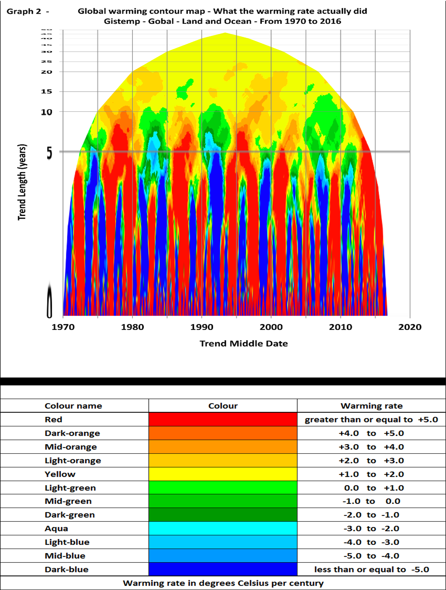
So I wondered what it would look like if I used a log scale. The following was produced simply by scaling the above graph – doubling the scale for every halving of period (I stopped increasing the scale of shorter periods when it appeared to have no detail).
Also, as I’m not just going to print fraudulent material on my blog, I’ve cooled the trends by about ~0.3 (which mainly impacts the perception of the longer term trends)
 Discussion
The average length when the scale is on this logarithmic format is around 5years. And not surprisingly there is almost no sign of any warming or cooling trends below 5year. Indeed, I’m surprised how regularly we change fro blue to red.
It’s then apparent that around periods of 5-10 years we start to see repeated periods of green (virtually the only part of the plot)
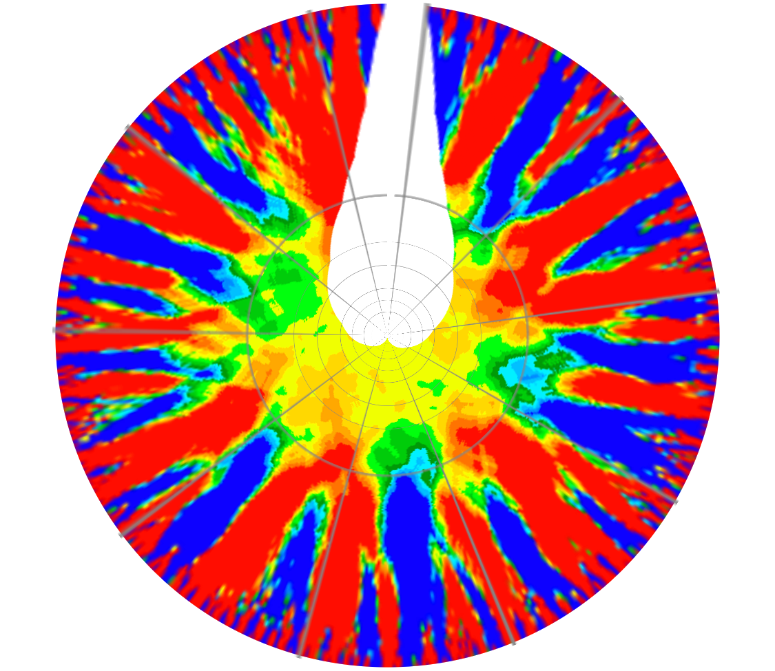
However, now I look, as we move up the plot, the size of the peaks get larger. So a change in trend lacks prominence at the bottom, whereas a 1 year trend over 1 year should be as prominent as a 40yr trend over 40 years. So, as it’s late, I’ve quickly used a distort to create an image where the variations in trend have roughly similar prominence irrespective of their length and this produces the image below.
 Now the question I’m asking myself is “why does the image move from a region of rapid climate change over periods of less than 5year, to one with very low rates of climate change over periods longer than 5years
Time for bed

