Josh had a great tweet today:
The #Pause its 58 years old! https://t.co/w1aEk3oZoV … from @SteveSGoddard
— Josh (@Cartoonsbyjosh) April 5, 2016
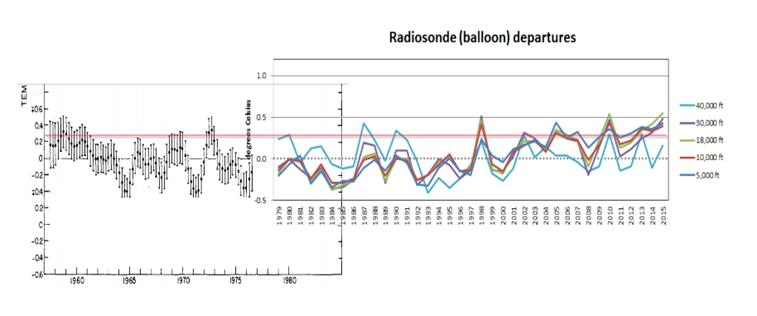
Which took me by surprise as I’d just been speaking to Josh about the same article. But yes! I suppose technically, although I’ve not checked the data myself, the meteorological balloon data does seem to show around 58 years of pause:

A combination of some old balloon data which Tony found in an old publication (oh how the alarmists must hate these old publications) and recent balloon data which corroborates the lack of recent warming seen by the satellites.
That’s a massive jump. The pause is less starting into adulthood, and closer to being an OAP.


The composite graph by Tony Heller (who uses a pseudonym of Stephen Goddard for his online blog) is a fraudulent fabrication since it is comparing two different types of observations. Here are the COMPLETE historical radiosonde (weather balloon) temperature anomalies for the lowest 1/2 of the atmosphere.
.
http://www.durangobill.com/GwdLiars/GwdRATPAC850.jpg
http://www.durangobill.com/GwdLiars/GwdRATPAC700.jpg
http://www.durangobill.com/GwdLiars/GwdRATPAC500.jpg
.
(Radiosonde Atmospheric Temperature Products for Accessing Climate (RATPAC))
.
The description for the above charts can be found at:
https://www.ncdc.noaa.gov/data-access/weather-balloon/radiosonde-atmospheric-temperature-products-accessing-climate
.
If you follow a couple of links at the above webpage, you can access the source data for the above charts. It’s the 850 mb, 700mb, and 500 mb data in the “Globe” section at:
http://www1.ncdc.noaa.gov/pub/data/ratpac/ratpac-a/RATPAC-A-annual-levels.txt
.
Documentation showing how Tony Heller (Stephen Goddard) fabricated his “no warming” fallacy can be seen at:
http://www.durangobill.com/GwdLiars/GwdGlobalWarmingStoppedIn1998.html
(Near the bottom of the page)
Bill, first, Tony makes it clear the two graphs are different and so accusation that its “fraudulent” on that basis is totally unwarranted.
And the key question is why haven’t we seen the earlier meteorological balloon data? The only explanation I can see is because it doesn’t support the bogus warming graph that you link to on your blog.