Time and again I hear nonsense from people saying climate signals are, or are not, “significant”, by this they suppose they mean “cannot be normal”. But they ignore the fact that in order to say whether or not something it abnormal, we must know what is normal. And they do not know what is normal but assume a model of “normality” which is totally wrong for the claimate. So I decided to write this explanation of 1/f climate noise to help explain the difference.
uBurns.com
It’s often easier to see something that for someone to explain it. So it might help to have a look at the demo of 1/f noise I have at uburns.com (I’ve jokingly portrayed this as a “forecast” but it just generates noise similar to climate noise. Further info is on the about page. I’ve got some results showing how variance increases: Statistics of 1/f noise – implications for climate forecast. And I’ve even collected together a few examples of how 1/f noise causes errors in interpreting data even by sceptics: Natural habitats of 1/f noise errors.
Also for a wider perspective of how we need to know the underlying variation in order to know what is meaningful see: Lies, damned lies, and statistical significance of climate trends
Normal Variation
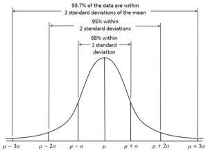
The so called “normal distribution” shown right is arguably one of the worst concepts in the whole of mathematics and science. I suspect is the single biggest cause of the failure of climate academics to comprehend why they can’t predict the climate.
In science, students are taught that noise follows this “normal” distribution. But this is only true for a very few types of measurements. Because it assumes that the natural variation or noise present at each reading is unrelated. In real life, almost all measurements have noise or variation that is persistent in that we have the same source of noise that sustains from one reading to the next. A simple example is the variation of a candle. The flicker is caused by many things, but e.g. one will be air flow. And if that air flow is a door that is sometimes open and sometimes not, then the effect of that door will tend to be the same on successive readings.
Normal noise isn’t “normal” noise.
Except in a few very rare circumstances, all variations contain a degree of persistent noise so that the noise in successive readings is not independent.
What this means is that unlike “Normal” noise, real noise from real systems tends to have trends, oscillations, steps, so that the “normal” value one day is not the normal value the next. (see Natural habitats of 1/f noise errors.)
So, far from being “normal”, the normal noise is in reality an idealistic assumption about reality which is false. So, we cannot just assume the so called “normal variation” is the type of variation we have in any system and so before we can apply any statistical tests we first have to determine what is normal. If it can be approximated by “normal noise” then great! We can use the very simple statistics that students are taught and seem to be prevalent in climate academia.
But unfortunately the global temperature is clearly not this “normal noise”. We know we have long periods where natural variation makes it warmer like the medieval warm period and we have long periods when natural variation makes it colder such as the little ice-age. So right away we can categorically rule out the standard statistical tests.
You just cannot use them.
Unless you understand what is “normal” you cannot know what is “abnormal”
The first thing a professional person must do when investigating any signal such as the climate is to determine what is “normal”. Because unless we know what is normal, we do not know whether the signal is behaving normally and it is not possible to say whether e.g. a change is “significant”. Unless we know the likely distribution of values or trends we do not know whether the change or value we are considering is something that could reasonably be expected when things are “normal”.
So, what is normality in the temperature signal?
Scales of Variability
As fig 2 (below) shows, global mean temperature variation in the instrument record increases rapidly when longer periods (p) are considered approximately as follows:

For any change seen over periods of one decade, much greater scale changes are expected over longer periods of centuries but much less change is expected over the year to year scale. This is the characteristic of 1/f noise or more precisely 1/fn (where 0 < n < 2).

Fig 2: Variability of observed global mean temperature as a function of time-scale (°C2 yr–1)
from figure 9.7 IPCC (2007)
This graph, shows the scale of variation increases rapidly from the year-to-year scale of measurements to the century-to-century scale of measurement. There is no point arguing that the same physics applies over the long term so the same level of noise must be present because in his famous paper on the Butterfly effect, Lorenz makes it clear that whilst the same basic physics apply: “each scale of motion possesses an intrinsic finite range of predictability”.
But if all we allow ourselves is just over a century of global temperature measurements, we cannot from the same sample decide how the climate typically behaves over a century and also decide it is behaving abnormally.
The same sample cannot both be used to decide what is “normal” for the climate and then for us to use this “normality” to decide the normal section is “abnormal”.
Likewise, if we are to decide what climate change is normal for a decade, we must start with a period we consider normal … e.g. the first half of the 20th century and then we must look at another period to see whether it contains features than cannot be explained by the variation typical over a decade in the “normal” period. So we could ask:
“Is the 0.48C rise from 1970 to 2000 abnormal”.
And we can answer this by saying:
“in the ‘normal’ period we find the same 0.48C rise over the same period from 1910 to 1940 so we must conclude that it is normal”
But here we run into a problem because many assert (without much evidence on their side) that CO2 was rising before the accurate measurements started in 1958.
We need a longer period
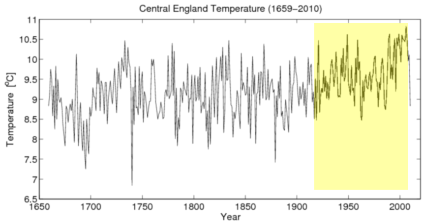
Is there a longer period over which to measure “normality”? Fortunately there is. It is the Central England Temperature record as shown below:
Above is the longest continuous record of temperature in the world. And I’ve roughly marked the period of “man-made warming” in yellow. So, the question now becomes this:
“is the period of man-made warming sufficiently different from the rest of the CET record to indicate it is abnormal”.
Another way to ask this question is this:
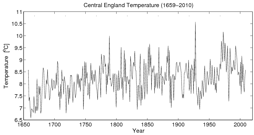
“can you spot the period of unusual 20th century warming in the graph when I swop the data around”
Unless you know what to look for it is now very difficult to spot the 20th century warming. If you said the period shown 1930-1970,then you are wrong. Instead the graph is upside down and reading right to left and the 20th century warming is now the “warming” from 1660-1710.
So, going back to the original graph we see the period of manmade warming has a change from 1920-2000 of around 9.2C to 10.5C or 1.3C in 80 years = 1.6/century. Is this abnormal? No, because if we look, we see that in the much shorter period from 1690 to 1730, the climate warmed from 8C to 10C. So, 2C in 40 years, 5C/century or 3x as fast as the 20th century supposedly “unprecedented” warming.
And indeed, there are numerous similar periods with similar scale change. We can see cooling from 1660-1690, warming from 1820-1840 & 1880-1910 all very similar in scale to the supposedly “unprecedented” warming at the end of the 20th century. So the 20th century change is actually very typical and not at all unusual.
Correlation between CET and global Temperature
Unfortunately, the world has some who would rather trust a global temperature created from a single tree trunk when it fits their political view (and then hide the decline when it doesn’t) rather than use an real thermometer which doesn’t fit their view.
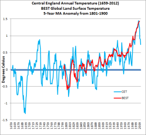
But this idea that CET is not a very good proxy for global temperature is not born out by the evidence. Fig 5 (below) shows how the Central England Temperature (blue) compares to global temperature (red). They are actually a very good fit showing that a regional dataset like CET is a very good indicator of global trends.
In contrast, see how the tree rings compare below:
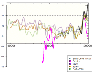
Fig 6: Tree ring proxy as used in the notorious “hide the decline” graph showing in pink the section that was not draw and so clearly demonstrates how poorly tree ring “thermometers” match actual temperature readings (black) or other proxies (other colours) source
This is how the infamous “hide the decline” graph would have looked if the whole tree ring proxy (Pink) had been included. It is appalling bad and shows very little match to actual temperature (black) or other proxies (other colours). This demonstrates the dishonesty of climate academics. They not only hide the decline and pretend tree rings are a good proxy, but they refuse to use the Central England Temperature record which is clearly a very good proxy for global climate because it doesn’t show the wanted “scary warming”.
Conclusion
There is no need for complex stats here. Even a cursory glance at CET shows plenty of natural variation not only of a similar scale but also much larger than the 20th century warming. So, there is absolutely no evidence either within the available global temperature record or within the longest temperature record of anything abnormal occurring: either in the latter half of the 20th century (globally) or in the 20th century (CET).
Therefore, given that the 20th century changes are very typical within the temperature record, this means that if we were only looking at these temperature records, then we would be forced to conclude that the whole 20th century change is most likely due to natural variation.
However, from the work of people like Prof Hermann Harde, we know that rising CO2 is likely to have caused a modest amount of warming of perhaps 0.1 – 0.3C. However, although we expect some man-made warming, within the context of what is very likely a majority of natural warming in the 0.8C rise last century, given the scale of natural variation we know to be present, whilst this man-made warming should have an effect, it is as yet too small to show itself as a recognisable change distinct from the larger natural variation.


Fantastic job mate! Is it not impossible to ever get enough data to identify what’s normal? There were times when watch had much more co2, we’ve had ice ages, we have had major volcanic events, and pole reversals. How is it even possible to comb out a single thread from the data and point to it and say “this is the man made part”.
the existence of the CET data is lucky for us indeed. It just shoes how futile predicting climate is, and we as humans evolved to ADAPT. Yes, we adapt to change. Its what we do, and to self impose limits on our growth to avoid the change that always comes is just silly.
~s
Your results are meaningful and this is interesting, but I think you’re confused about the etymology of the “normal distribution.” At first I wasn’t sure if you were trying to point out that it is not the case that “normal” has something to do with the concept of being “regular” or “usual” etc, based on the fact that you kept placing “normal” in quotes – but now I’m not so sure. You have a graph of it and refer to it as “the so called normal distribution.” I don’t understand the use of the phrase “so called” – that’s actually the name of the distribution (also Gaussian, whatever.) John Cook explains:
http://www.johndcook.com/blog/2008/03/13/four-characterizations-of-the-normal-distribution/
I’m also confused by “swap the data around” … so you took the graph, turned it upside-down, and then flipped it to be right-to-left … but you left the axes the same? I’m just confused as to what this is demonstrating.
Cool site!! +mike
Pingback: What Are The Chances Of Getting All These “Record” “Hot” Years? | Scottish Sceptic